Bees vs Neonicotinoids
Overview
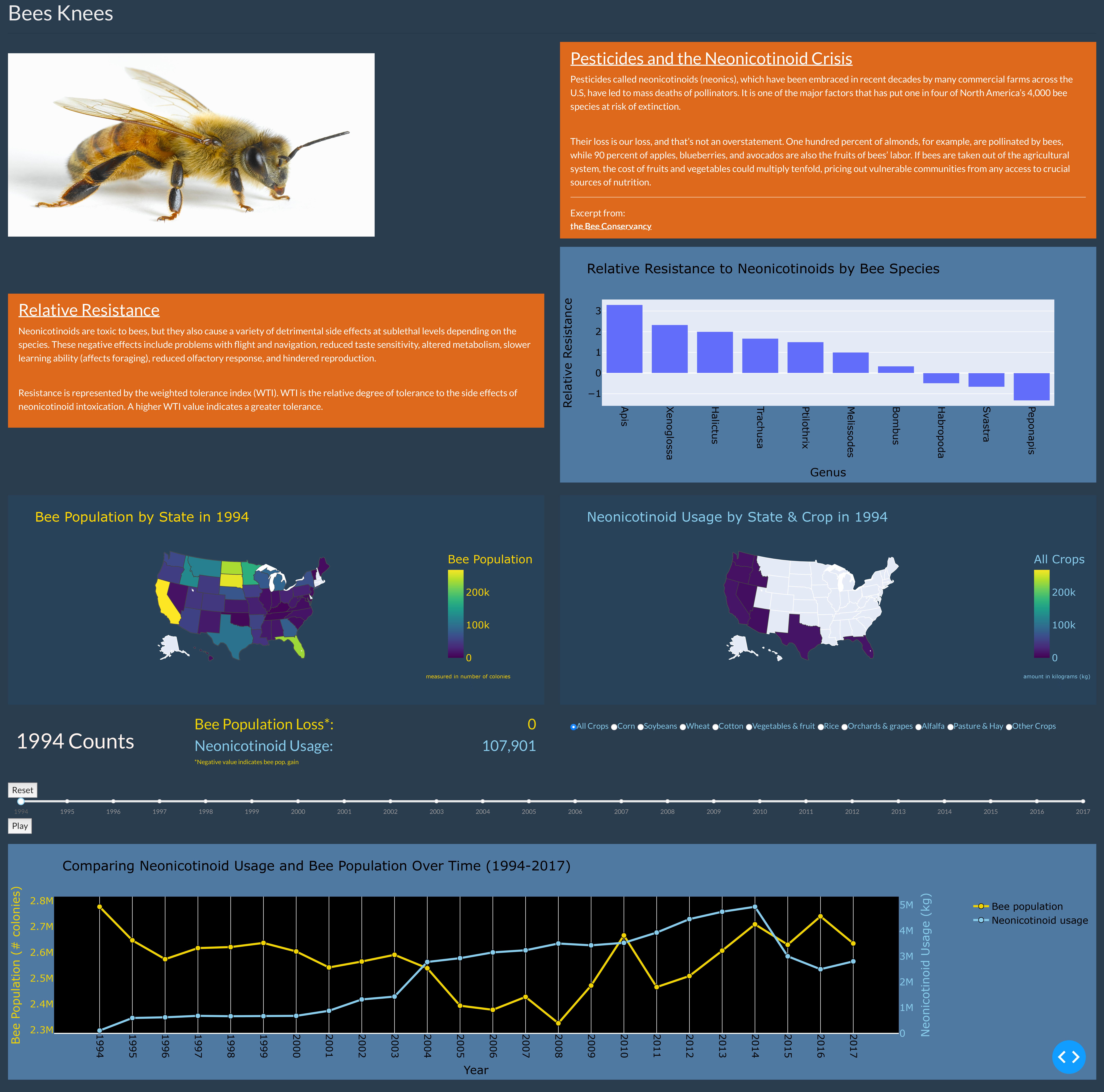
I worked in a team to develop a data visualization as a final project for the class ICS 484. This visualization is a webpage illustrating the impacts of a type of pesticide known as a neonicotinoid on bee populations in the US over the time period 1994-2017. We utilized GitHub, the Visual Studio Code IDE, Python, and a visualization framework called Plotly Dash to create our project. The visualization is composed of three main sections. The first is an intro section introducing the problem neonicotinoids pose for bees and how this pesticide impacts certain types of bees. The next section is composed of two maps, one that displays the change in bee populations over time and the other that displays the change in neonicotinoid usage over time. The final section is a line graph summarizing the changes presented in the maps and making the trend apparent to the viewer. The visualization is interactive and contains a timeline and a counter so that viewers can better see how neonicotinoid usage and bee populations change over the 1994-2017 time period.
Datasets
Dataset 1
In regards to data, we chose three datasets for the project. The first dataset is titled “Raw data for imidacloprid effects on native bees,” and it originates from the USDA Agricultural Data Commons. This dataset contains both laboratory and field data and details the impacts of four sublethal concentrations of a neonicotinoid insecticide called Imidacloprid on honeybees, as well as several other bee species native to Mississippi, which is where this dataset was created.
Dataset 2
The second dataset is called “Estimated Annual Agricultural Pesticide Use by Major Crop or Crop Group for States of the Conterminous United States, 1992-2017 (ver. 2.0, May 2020),” and it illustrates the change in pesticide use over the time period 1992 to 2017.
Dataset 3
The third dataset is named “Bee Colony Statistical Data from 1987 - 2017,” and it shows the change in bee populations in the US over the time period 1987 to 2017. This dataset includes bee census data by county over the years 2002, 2007, and 2012; bee survey data by state over the years 1987 to 2017; and bee colony loss data from 2010 to 2017.
My Role
I was a member in a team of four. I took charge in many components of the project. First, I created a weighted tolerance index bar chart showing how well different bees resisted neonicotinoids. I also created the summary line graph highlighting the changes in neonicotinoids over time versus bee populations over time. I also created a counter that would display bee loss and neonicotinoid usage for a specific year. Finally, I implemented the functionality of the timeline so that all the maps and the counter would update with each year. Taking on this project was a new experience, but I learned a lot about visualization and Plotly Dash from it.
Link to Project: BeesKnees-GitHub Link to Visualization: BeesKnees-Vis